Create a basic modal in Next.js with Tailwind
Make a modal without editing your _document.js file or using global state
I want to create a login modal that is accessible from a navbar. By leveraging Tailwind's functionality, we can create a modal in the navbar.
Note: A lot of big websites' login/signup modals do not close on outside click. We too will not use this functionality.
I create a basic navbar to be imported into the pages I want it on.
import { useState } from 'react'
import Modal from '../components/modal'

const Navbar = () => {
  const [modalState, setModalState] = useState(false)

  return (
    <div className="flex">
      <div className="m-5">
        home
      </div>
      <div className="m-5" onClick={() => setModalState(true)}>
        open modal
      </div>
      <div>
        { modalState && <Modal setModalState={setModalState} /> }
      </div>
    </div>
  )
}

export default Navbar
I make a parent div with 'flex' to make it a row and add some children divs' with 'm-5' for margin. My navbar includes a 'home' div that does nothing and a div that changes 'modalState' from false to true. Then, if 'modalState' true, I render my Modal (I pass the 'setModalState' function to be used later).
Next I create the modal background.
const Modal = props => {
  return (
    <>
      <div className="fixed inset-0 opacity-25 bg-black">
      </div>
    </>
  )
}

export default Modal
When the modal is on, I want the whole app/page to be greyed out.
- 'fixed inset-0' - This allows us to cover the whole viewport
- 'bg-black opacity-25' - Since this element is covering everything we need to use see-through black as opposed to something like 'bg-gray-400'.
Now that we have the background established, let's create the actual modal element.
const Modal = props => {
  return (
    <>
      <div className="fixed inset-0 opacity-25 bg-black">
      </div>
      <div className="fixed inset-0 flex justify-center items-center z-10">
        <div className="bg-white">
          <div onClick={() => props.setModalState(false)}>
            x
          </div>
          <div>
            hello
          </div>
        </div>
      </div>
    </>
  )
}

export default Modal
Let's look at the outermost div:
- 'fixed inset-0' - We use this again because we don't want our element's positioning to be relative, this way it'll be in the same position no matter what page we open the modal on
- 'flex justify-center items-center' - This simply centers the children's elements, vertically and horizontally
- 'z-10' Z controls stack order. Let's say you have some other elements using the Z-index and you want this modal to sit above everything else, you could use 'z-50' instead of 'z-10' and 'z-40' on our previous div, the background element.
Next, we have a child div with 'bg-white'; this defines the background for our text.
Then we have a div with 'x' to close the modal. We use the function we passed earlier through Navbar's props, 'setModalState' and set it to false so the Navbar rerenders without the modal.
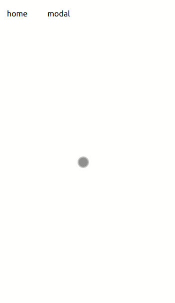
It's a little rough-looking but it works.
Note: If you're not getting a gray background, check your tailwind config file for 'mode: "jit"' and remove it.